
What is greige? How to use it in your home
The colour grey has remained popular in interior design for many years, prized for its ability to provide an understated base that coordinates effortlessly with fabrics, furnishings and accessories. There has recently been a shift away from very cool, blue-toned greys towards a softer, warmer alternative, often known as ‘greige’.
But, what colour is greige? A blend of ‘beige’ and ‘grey' in both name and colour, greige paint colours allow you to bring a little more warmth into your schemes to create a gentle and soothing living environment – the perfect shade to embrace throughout your interiors.
Explore the palette of greige shades from Little Greene and discover ways to introduce these paint colours in different parts of the home.
Ceiling: Portland Stone– Pale, Upper Walls: Portland Stone – Light, Dado Rail, Door & Trim: Portland Stone, Cupboard: Dark Brunswick Green

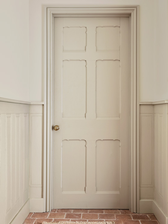
Far Wall: French Grey – Pale, Right Wall: Portland Stone – Dark, Woodwork: French Grey – Pale
Find your perfect ‘greige’ in the Colour Scales
The Little Greene Colour Scales is a palette of colour families that feature softly graduating tones of one base colour. This allows you to combine shades from one family on your walls, woodwork, ceiling and furniture to create a coordinated, tonal scheme.
Within this palette, there are four classic greige colour families that provide a beautiful soft neutral base in any interior setting: French Grey, Portland Stone, Rolling Fog and Slaked Lime. Each comprising four diluted shades that range from ‘pale’ to ‘dark’, these natural ‘greige’ hues are the best greige paint colours to use on interior features throughout your home and provide a sense of continuity from room to room.

French Grey
This authentic Victorian paint colour has been termed the ‘king of the greys’, as it offers warmth and generosity. Due to the inclusion of both blue and red in its formula, it is a perfectly balanced greige that’s neither too warm nor too cool.
You can use French Grey and its coordinating Colour Scales in both dimly lit, north-facing rooms and sun-drenched south-facing spaces, where it will provide a relaxed, neutral backdrop for decoration. Its elegant, understated character enables you to keep the scheme neutral and pared back, or make more adventurous colour choices on your furniture and accessories.
French Grey Colour Scales


Portland Stone
For a neutral greige which offers subtle yet noticeable warmth, consider shades from the Portland Stone family. Another Victorian paint colour, Portland Stone is timeless and easy to use. It is based on completely natural pigments, formulated to match the original Portland stone used in the construction of many significant buildings in London.
As grey-based neutrals, the Portland Stone Colour Scales provide an ideal backdrop for fabrics and patterns, allowing them to become the focus of your scheme. Its natural hue also creates subtle connection with the outdoors, creating a calm, comforting space where you can relax and unwind.
Portland Stone Colour Scales


Rolling Fog
The warmest of our greige families, Rolling Fog is a soft and soothing neutral that was used historically as a white with darker colours. In contemporary schemes, these shades are particularly effective when used in combination, with different tones used to paint the walls, woodwork and ceiling to create a real sense of serenity and harmony.
Consider using Rolling Fog to team with natural wood or stone flooring in a space where you want to create a restful and inviting atmosphere. This could be a spacious master bathroom or a welcoming entranceway that sets the tone for the rest of your home
Rolling Fog Colour Scales


Slaked Lime
Slaked Lime is a pure, neutral white that is made with a combination of mineral pigments. In the Colour Scales, this shade is presented in three deeper variations that provide a beautiful, soft greige backdrop in any interior setting.
You can easily combine Slaked Lime with its related, darker hues to create a harmonious scheme that offers a gentle, tranquil feel. Or use Slaked Lime as a white alongside any of our other greige families to add an element of complementary contrast on the woodwork or ceiling.
Slaked Lime Colour Scales


Add impact with a contrasting colour accent
While greige is a wonderful shade to use all-over in a calming, neutral scheme, it also pairs beautifully with stronger accent colours to bring impact to your interiors. The versatility of greige means it can coordinate with a vast range of colours, but it combines particularly well natural hues, such as rich greens and deep earthy reds, to retain a soothing atmosphere.

Colour blocking is a great way to introduce stronger, complementary colours and create an interesting focal point. Pair French Grey with Tuscan Red on the lower wall for an inviting bedroom scheme, or add impact to your neutral dining space by combining Rolling Fog with the sumptuous dark red, Arras.

A confident, resonant green such as Dark Brunswick Green is an excellent choice to feature in your hallway, creating a sense of continuity as you come in from the outdoors. Use this vibrant dark green on cabinetry, and pair with shades from the Portland Stone family on the surrounding walls and woodwork.
Explore our complete palette of neutral paint colours, or begin your home refresh with a complimentary colour card.


