1970s Paint Colours
1970s paint colours were the culmination of high chroma colour, a long-lasting trend. Explore our distinctly 1970s shades below.
1970s Paint
Beyond the discovery of new and inexpensive synthetic pigments, the eye-acceptability of bright colours in combination became an accepted style for the first time in the 1970s. The vibrancy and high-energy nature of some of these retro paint colours leads us to choose carefully; use these bold 1970s paints as highlights paired with neutrals, in the case of colours such as Phthalo Green or Leather.
Other 1970s hues, which have stood the test of time, have become iconic standards in their own right, including Aquamarine Deep. Rather than pairing this rich shade with neutrals, it excels in combination with lighter versions in the same family or darker greens such as Livid or Invisible Green.
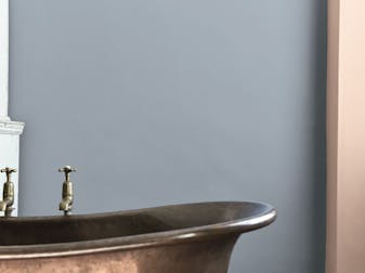
Deep Space Blue & Marigold Bathroom

The use of bright colour became endemic during this decade which has seen a recent revival to match the era – excellent examples are Marigold, Atomic Red, Leather, and Tivoli.Talk to a Colour Consultant

Shop by Period

