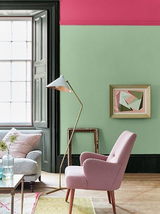
Embrace the colours of spring in your schemes to bring joy, peace and calm to your living environment. Paint for spring and be inspired by the colours of nature – from fresh and vibrant greens to soft, floral pinks and yellows – to create harmony and connection with the outdoors.
Discover a selection of spring colours for living rooms, bedrooms, or even nurseries in the Little Greene palette that will offer an uplifting air of springtime throughout the whole year.
Spring paint colours to use in your home

1. Pea Green
The true colour of nature, green is a beautiful spring colour choice to bring the outdoors in and revive your living space. The classic light green, Pea Green, has a soft, peaceful hue that feels comfortable in the home.
Pair Pea Green with the complementary neutral, Slaked Lime, to create an elegant scheme that’s perfect for a bedroom or living room. For a stronger statement, team Pea Green with the statement pink accent colour, Leather, in a colour blocking design that makes an impact.

2. Citrine
Like most greens that contain yellow, Citrine has an inherent earthy quality, meaning it has a strong association with the natural greens seen in our outdoor surroundings. When used in the home, Citrine will create a warm, inviting setting where you can feel relaxed and uplifted.
Citrine is a wonderful colour to embrace all over to really energise your space and create a cocooning, wraparound effect. Alternatively, pair Citrine with Sky Blue on the ceiling to reflect a natural landscape. This combination works well in an entranceway, creating beautiful flow as you come in from the outdoors.

3. Green Stone
You can use muted greens to hint at nature in a softer, more subtle way. A natural, muted green, Green Stone sits comfortably in most interior settings – an excellent alternative to neutral walls to evoke the tranquillity of the outdoors in the home.
Offered in three shades of graduating strength, use the Green Stone family in combination to achieve a harmonious, muted green scheme. Consider this palette of shades for a nursery space to create a calming, soothing space for your little one.

4. Masquerade
With a colour that is reminiscent of spring blossom, soft and gentle pinks are instantly associated with springtime. Rather than a sugary light pink, opt for a pink that contains red ochre for a more natural tone that will provide warmth and elegance. Spring paints like Masquerade have an alluring, powder-pink hue that is easy to use in many interior settings, creating a comforting, nurturing feel.
As one of our Colour Scales families, Masquerade can be used with confidence alongside any of its related shades. Or to create a beautiful spring floral scheme, consider using Masquerade with a complementary wallpaper, such as Poppy Trail – Masquerade or Spring Flowers – Garden.

5. Celestial Blue
Light blues are another wonderful choice for a spring-inspired interior, reflecting the calming colour of the spring sky. Celestial Blue is a dusky, pastel blue that is one of the oldest colours in our palette – discovered on a paint colour card of 1807. It therefore has a truly timeless feel, a beautiful addition to both interior and exterior schemes.
Consider teaming Celestial Blue with a vibrant green like Garden to evoke the reassuring combination of natural greenery against an optimistic blue sky. This soft pale blue also pairs well with fresh, mineral whites like Slaked Lime and Shirting for a classic look.

6. Carys
After the long winter months, spring is a time when we begin to see the signs of summer in the world around us, and look confidently towards bright and sunny days ahead. Embrace a soft, joyful yellow to reflect this sense of positivity and hopefulness in your home. A classic Regency colour, Carys will provide a dose of sunshine that instantly boosts your mood.
Yellows like Carys are wonderful shades to use all over to really drench your room in sunshine and joy. Or take inspiration from the outside world and use Carys alongside the resonant blue, Air Force Blue, or bright green, Boxington.

7. Madeleine
If you are looking for a yellow that feels slightly richer, consider the soft gold, Madeleine. This muted yellow hue encapsulates the welcoming, restorative qualities of spring without being too bold, bright or vibrant.
Madeleine is the perfect choice to use in a colour-drenched scheme that will fill your home with a sense of warmth, comfort and optimism throughout the whole year. You could introduce a colour highlight of the striking pink, Carmine, to add a certain spring-like playfulness to your scheme.

8. Joanna
If you prefer neutral shades, you can certainly embrace spring in your home whilst using neutrals. Joanna is a natural pale taupe that offers serenity, harmony and warmth. When used all-over, it provides the perfect backdrop to introduce bright and lively furnishings, or keep things pared-back with natural materials and soft textural fabrics.
Consider pairing Joanna with a dusky pink like Blush or Mushroom on woodwork, adjacent walls or even the ceiling, to create a soft yet uplifting spring feel in your space.


