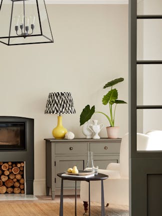
Designed to make choosing colours a pleasure and intuitive for the user, the dual 'Colours of England' colour card showcases all 196 Little Greene colours alongside a range of graduated shades in the ‘Colour Scales’ offering.
With confidence in colour central to the Little Greene ethos, the cards span over 300 years of historic interior design and include many authentic 18th, 19th and 20th century shades. These historic colours are presented alongside a carefully adjusted palette of contemporary shades, embracing modern interior design aesthetics and current decorating trends.
The ‘Colours of England’ card has been designed to meet the growing desire for classic, timeless colours that are both simple to choose and a joy to live with. The collection includes many significant shades from all over the British Isles that have contributed to the internationally renowned style of ‘English Interior Design’.

Our Creative Director, Ruth Mottershead, says:
'Some of the oldest colours on our colourcard remain the most loved. The historic colours are highlighted with a little red icon. It is often the case that the oldest shades are the most popular and timeless colours. ‘Celestial Blue’ is a beautiful soft hue, which is particularly popular for front doors and it originates from 1807. French Grey, one our most popular shades is actually a Victorian tone. Grey and Blue are colours that we feel very comfortable with and have a lovely history to them also.'
The ‘Colour Scales’ colour card offers a further eight families of diluted iconic Little Greene colours, and incorporates the ‘Stone’ and ‘Grey’ capsule collections, in a response to the increasing desire for easy and simple-to-scheme colours that create harmonious and monochromatic backdrops to decoration. The ‘Colour Scales’ card also includes deeper colours alongside the ever-popular diluted shades, as useful identifiers for the undertone of each colour family.

The card has been designed for ease of use. Each colour is one of a graduated family, grouped in columns according to undertone. Shades within the same column can be used together for tonal coordination, or across columns to create a balanced contrast.
Ruth continues: "The neutral trend continues subtly away from cold greys and traditional country creams, towards neutral stone tones, complex greys and nature’s favourite; green. By providing these soft tonal colours in families we can offer a subtle spectral range that consumers can combine with confidence. The lightest four shades work beautifully to add discreet depth to a room, softly defining characterful architectural features, or reducing the contrast of walls and ceilings which might be subjected to different light levels. The deeper shades can be used to complete a coordinated, harmonious scheme that, whilst monochromatic in hue, makes a strong statement with an expansive depth of colour.”
Featured Colours

'Hicks' Blue'
Hicks' Blue is a deep inky blue paint by prominent 60s and 70s designer, David Hicks.
Find out more
'Vulcan'
Sharing its name with the Roman God of Fire, this shade is inherently strong; a deep, charismatic, charcoal grey - with a little warmth retained.
Find out more
'French Grey'
A classic, timeless and extremely versatile shade, French Grey is equally valuable in the traditional home and the modern interior - calm living spaces, hallways, bathrooms and bedrooms.
Find out more
'Obscura'
An elegant, gentle blue-grey, this shade sits effortlessly in the tail of the Gauze Colour Scales family. Equally elegant used in solitude as among the lighter Gauze shades, this cool neutral works beautifully with natural floor textures; sisal, coir and jute.
Find out more
'Silent White'
Formulated in the quest for the perfectly balanced, neutral-warm white for a calm interior. Add softly spoken depth to the room by using its lighter and deeper versions on other walls, the ceiling and trim.
Find out more
'Masquerade'
With its delicate, powder-like hue, Masquerade – alongside the diluted versions of it – offers an alluring, natural undertone that is as ‘at-home’ in the bedroom as in the ballroom.
Find out more
'Portland Stone'
Portland Stone is a much-loved putty colour with bags of character. It's earthy, versatile and particularly elegant when used alongside its sister shades: Portland Stone Pale and Portland Stone Dark.
Find out more
'Gauze - Dark'
This lamp-black white is made in the same family as the Lead colours, but a little cooler.
Find out more
'Scree'
Scree is a really versatile, deep shade from our blue-based family of greys. It's fabulous as a wall colour in a modern interior and can be used as a backdrop to accessories or artwork.
Find out more


